
For Everyone Logo Design
Working as the Art Director for For Everyone has been a wonderful opportunity — not just creatively, but in helping shape the visual identity of a truly meaningful NGO.
From the beginning, I wanted the logo to express community, approachability, and connection. It felt essential that the design was simple yet meaningful — something that visually echoes the values of the organization. At that moment, the current logo was not achieving any of that. With the tea cup stains, it did bring some ‘earthy humbleness’ vibe but not what is needed.
I developed a one-line concept, a continuous line that forms both the letters F and E while also subtly representing one person embracing another. To me this speaks unity, care, and inclusivity — Our core values!
The original name was Wellbeing For Everyone, but as the project evolved, we made the decision to drop Wellbeing from the title. The organization is so much more than that. It represents advocacy, equity, culture, and the celebration of all people. The cleaner name felt stronger and more flexible while keeping the spirit of the work intact. “Drop the ‘Wellbeing.’ Just For Everyone. It’s cleaner.”
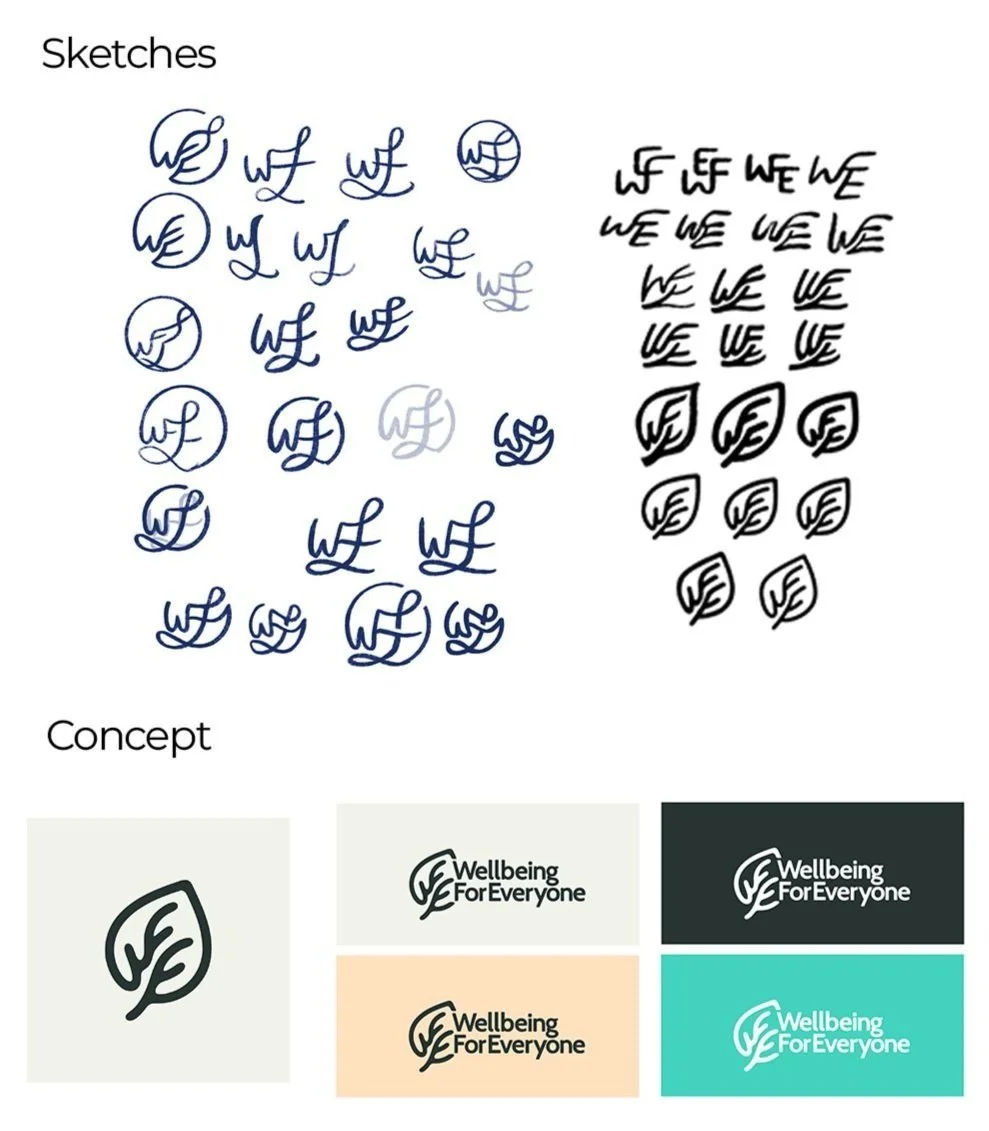
As you’ll see below, I’ve included some early sketches and thought process, showing how the logo evolved from a simple idea into something meaningful.


Designing The Logo
What started out as simple sketches on my iPad gradually took shape the more I messed around with the form. Basically doodling endlessly until I hit a point where I thought, “Yeah, this could have potential.” A little F and E in a circle just seemed too basic and typical of an approach.
Initially, the leaf design seemed like a good direction, but after going back and forth on it, we realized it gave too much of a nature-focused feel which definitely wasn’t what we wanted! Sure, For Everyone has a clean, grounded vibe that reflects its humility and openness, but we weren’t aiming for an earthy, eco-brand look..
So, that concept was dropped and it was back to the sketches again.

Changing It Up
To me, a great logo often carries some kind of double meaning. Like, the logo has more than just one layer baked into it. Sure, it can have the obvious “For Everyone” worked into it but what if it also carried something else? Like, the subtle look of people embracing. That’s what I aimed to incorporate here. It’s not so on-the-nose, per se, but it’s there!
I chose a font with strong readability and subtle curved edges — avoiding the typical sharp, harsh lines that didn’t match our vibe. No stark black in the colours, either. Connecting the r and y was a deliberate choice, adding a gentle visual nod to the theme of connection that runs through the entire brand. Essential!

Super proud of our rebrand.